Our Thought Process Behind Conversions
February 20th, 2017 by admin

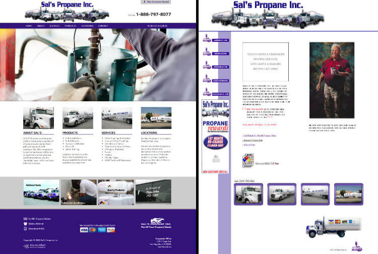
On the left the new site
We've learned over the years that every website has its own distinguishing elements. Sometimes a customer will want to take a whole new direction with their site and have everything look different, but usually that isn't the aim. Atomic8Ball works together with our customers to find the right balance between modernizing the site and keeping its best features. The goal is to get visitors interested in the products and services offered, through a site that is easy to navigate, welcoming, and featuring a good amount of content. If the visitor is easily confused by the structure, or can't find anything that answers their questions, they are tempted to leave and search for answers elsewhere. Visitors will also expect certain types of sites for different industries: sleek and high-tech look for IT companies, welcoming and informative for healthcare, professional and formal for legal offices, and so on. Atomic8Ball's designers work together with our customers to create a look that best represents your business, industry, and personality, so that you stand out of the crowd, but also meet the needs of visitors.
On the back-end, your site needs to be programmed for faster loading times, optimal search engine ranking, and be easy to update. While your average IT person can create a website that is well-designed and functional, they might not have the time and resources to keep up with industry recommendations, updates to different programs, and regular changes to search engine algorithms. You won't have time for that either - you should be focusing on your business! But at Atomic8Ball, we have an entire team of developers and designers who make it their business to know the best practices and standards for a good website. We'll implement them with your website conversion and create a back-end structure that is easy to change when needed, instead of requiring extensive new programming.
In the past, we've improved sites by decluttering homepages with too many graphics and textures, shifted the navigation bar to the top of the site while restructuring the sub-pages, replacing small images with large, high quality ones, and introducing more white space where it was needed to give sites a more professional look. We don't have a checklist for every conversion and our sites all look unique, but we do look for areas where we can improve your site for better visitor retention and professionalism.
This is only an introduction to how our thought processes when we work on websites. Send us some questions about our work and keep an eye out for our new and improved portfolio of completed websites!
Posted in: products, web services
