
The Atomic8Ball Difference - Website Showcase: Essential Hospice
February 19th, 2024 by admin
We're back again with another website showcase! The blog posts where we show the sheer difference in quality you and your website get with Atomic8Ball. This time, instead of looking over one of our older clients, we're showing off one of our newest clients! We'll be using their website as an example of how we can breathe new life into any website and bring it into the modern era and all the improvements that come with it.
Essential Hospice & Palliative Service
About Essential Hospice
Essential Hospice is a care team that develops a personalized care plan for each patient and coordinates services. They provide patient care, caregiver support, education, symptom management, and spiritual and emotional support to help those and their loved ones prepare for end-of-life.
Design: Updating Old to New
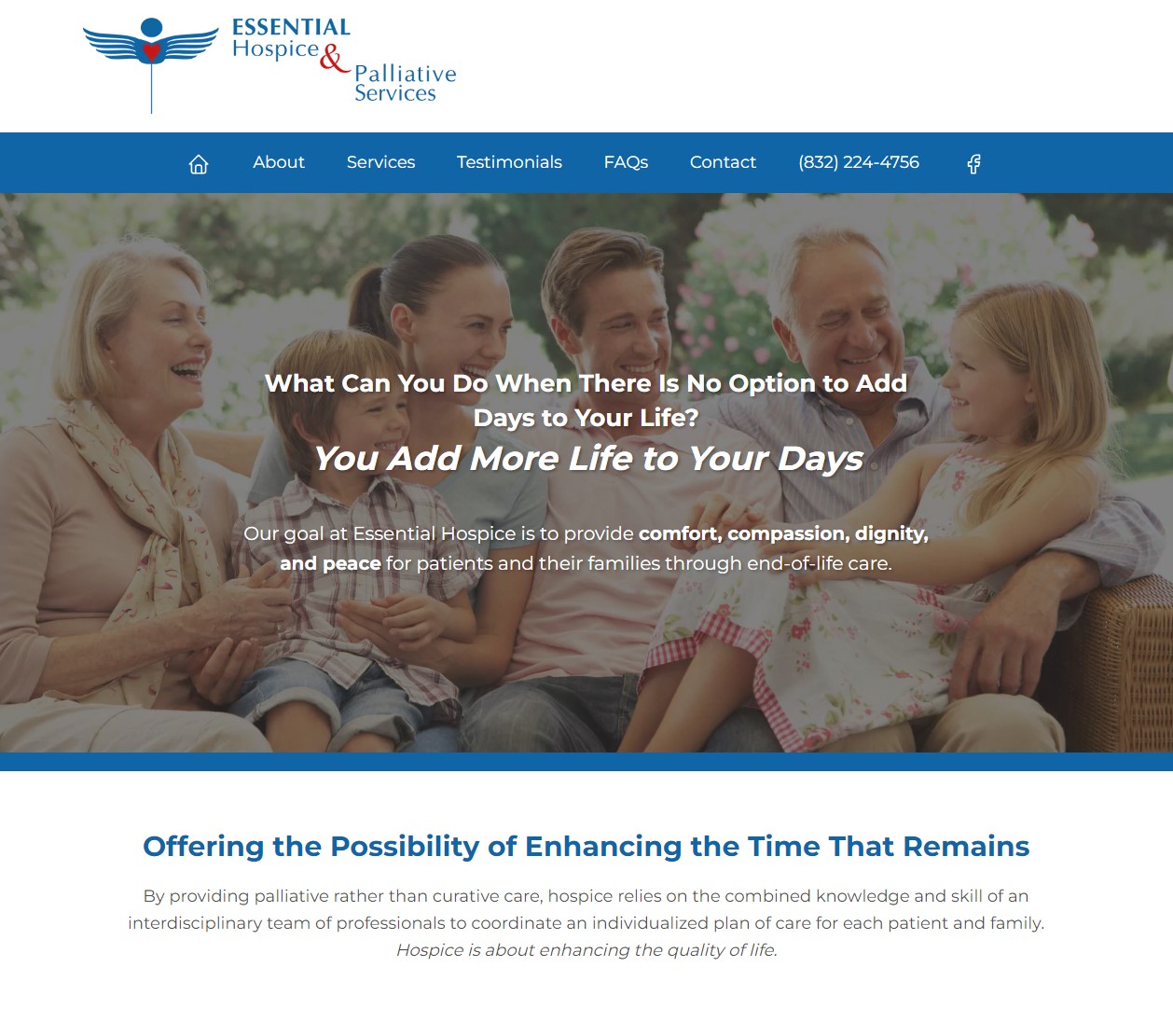
The Old
When you look at Essential Hospice's old home page, you can see how it's an older site with a design that hasn't been updated for some time. It's layout being off, and design elements clashing with one another due how out of date it is. Being most noticble in a few areas:
- The logo is in an awkward spot on the page, leading to two problems:
- Space is divided between between it and the navigation items in the header, making it difficult for new items to be added in the future.
- It causes the space between the header and the actual start of the body of the page to be nonexistent, leading to them blending with no clear line of separation.
- The page's content is only broken up by images and font changes, which doesn't break down content into distinct sections. This lack of distinction makes it difficult for users to want to engage with the website and can lead to potential clients leaving before even trying to learn more.
- Content thins out as the page goes on. While everything roughly fills the same space width-wise, the content begins to lessen in length and importance as you scroll down the page. While information overload is a common problem for many websites, lack of information can make a business look unprofessional or unskilled to users.
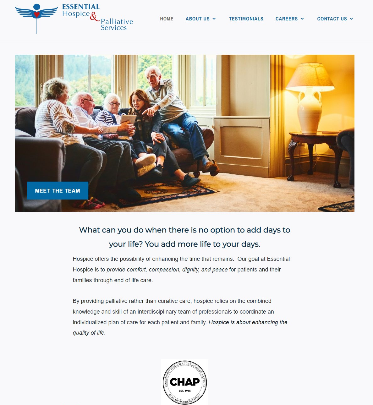
The New
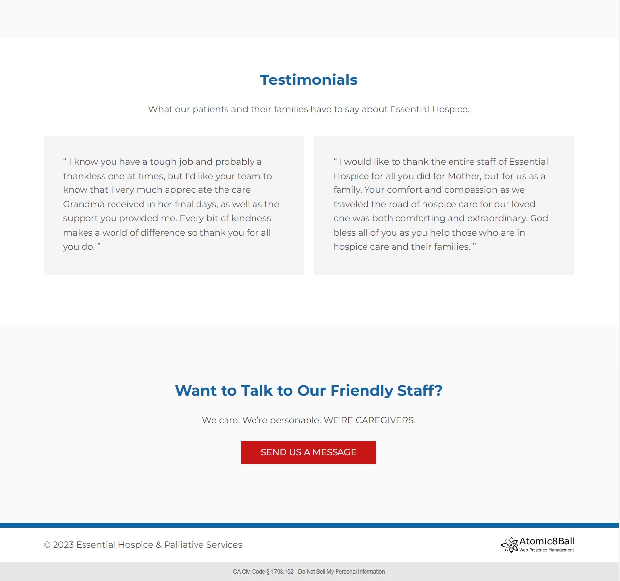
Now compare that with the home page that you just saw. Sections are clear and concise on where they start and end. The header space balanced between the logo and navigation, with both areas having space for new items if needed. The content fills the page better and is utilized to its full potential, as it's filled with important information and puts customer reviews front and center. All wrapped up with a lovely call to action at the end to drive engagement. Showcasing a perfect example of how bringing a fresh modern design to a website can drastically improve its ability to leave a good first impression.
Before and After
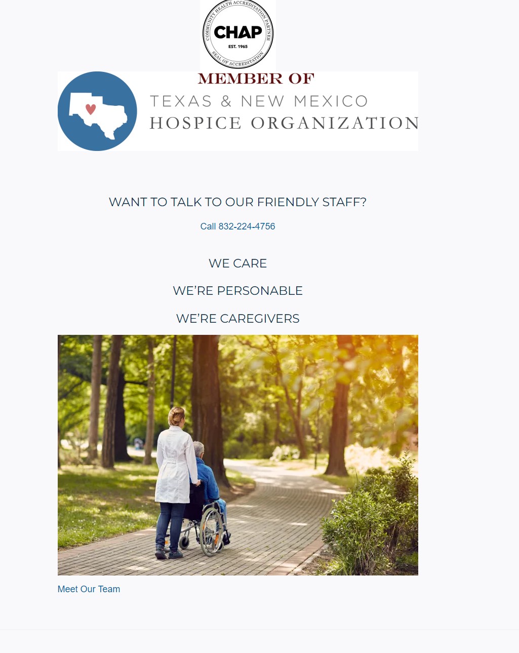
Contact Page
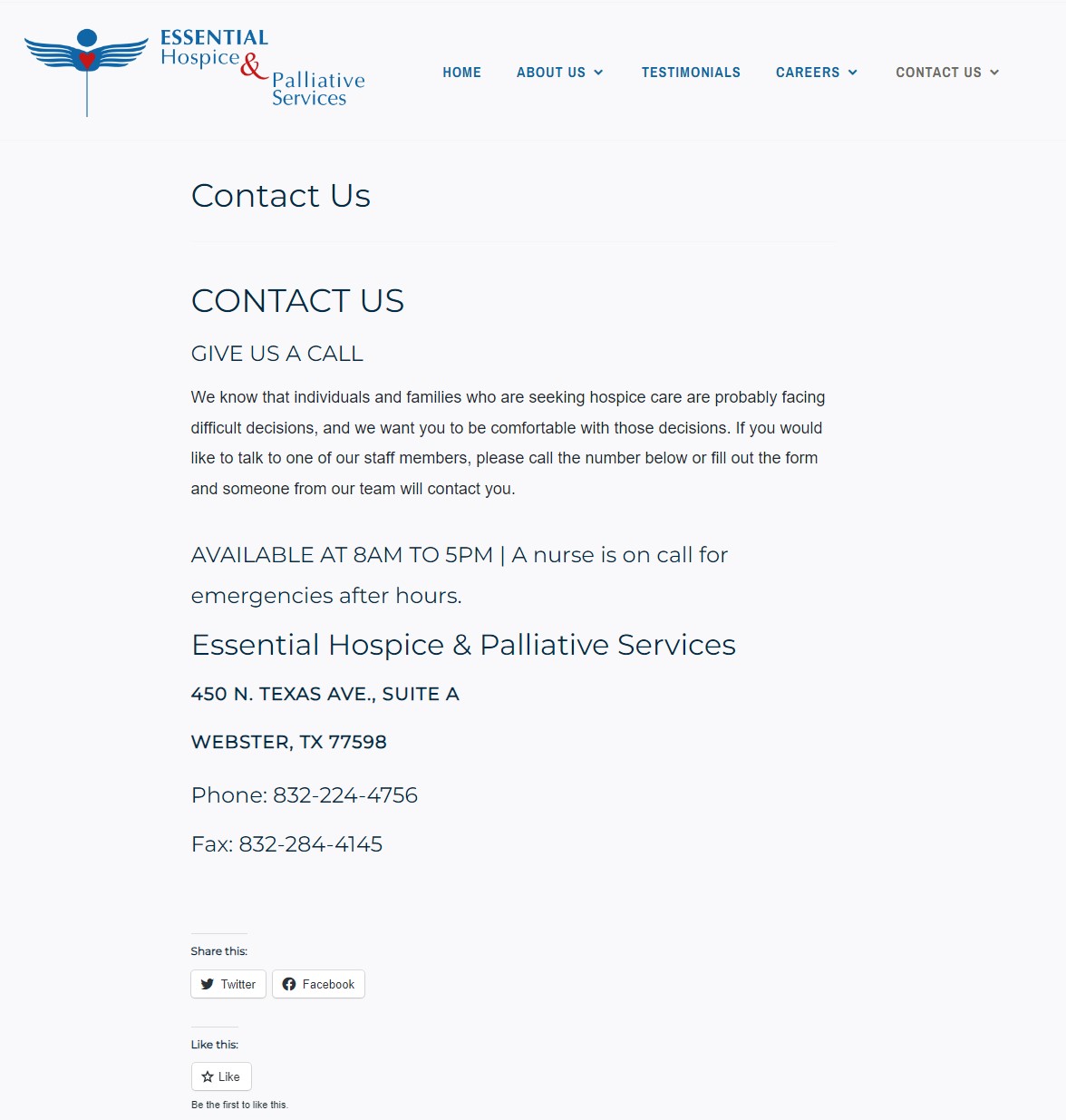
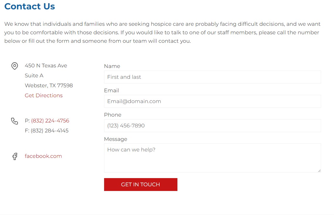
The difference between the old contact page and the new one is night and day. While the old page lists important information for getting in touch, it lacks all the modern convinces users have come to expect. That's why the new contact page maintains the important parts of the old contact page while introducing a contact form, a Google Maps link, and a Facebook link, on top of making the phone number a hyperlink for mobile users to take advantage of.
FAQ Page
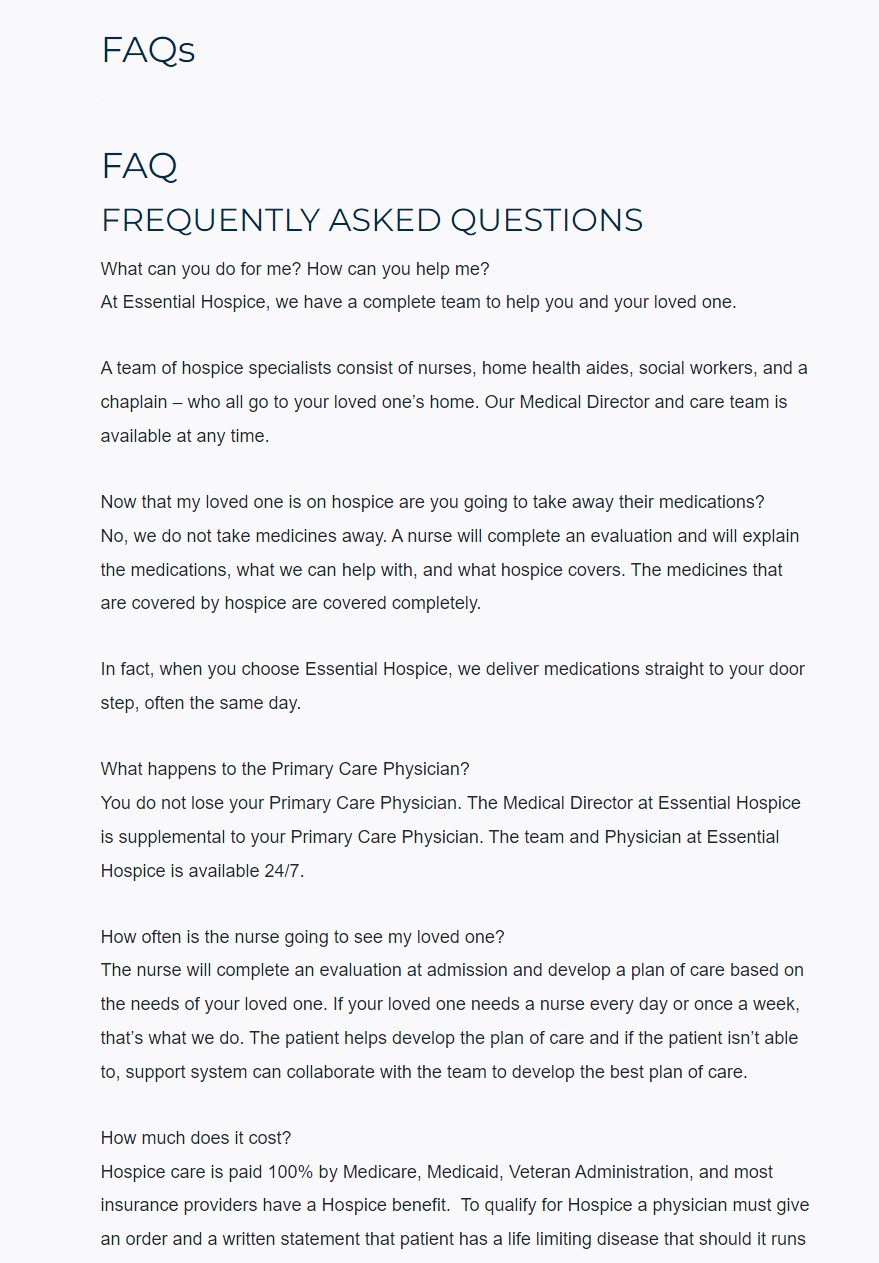
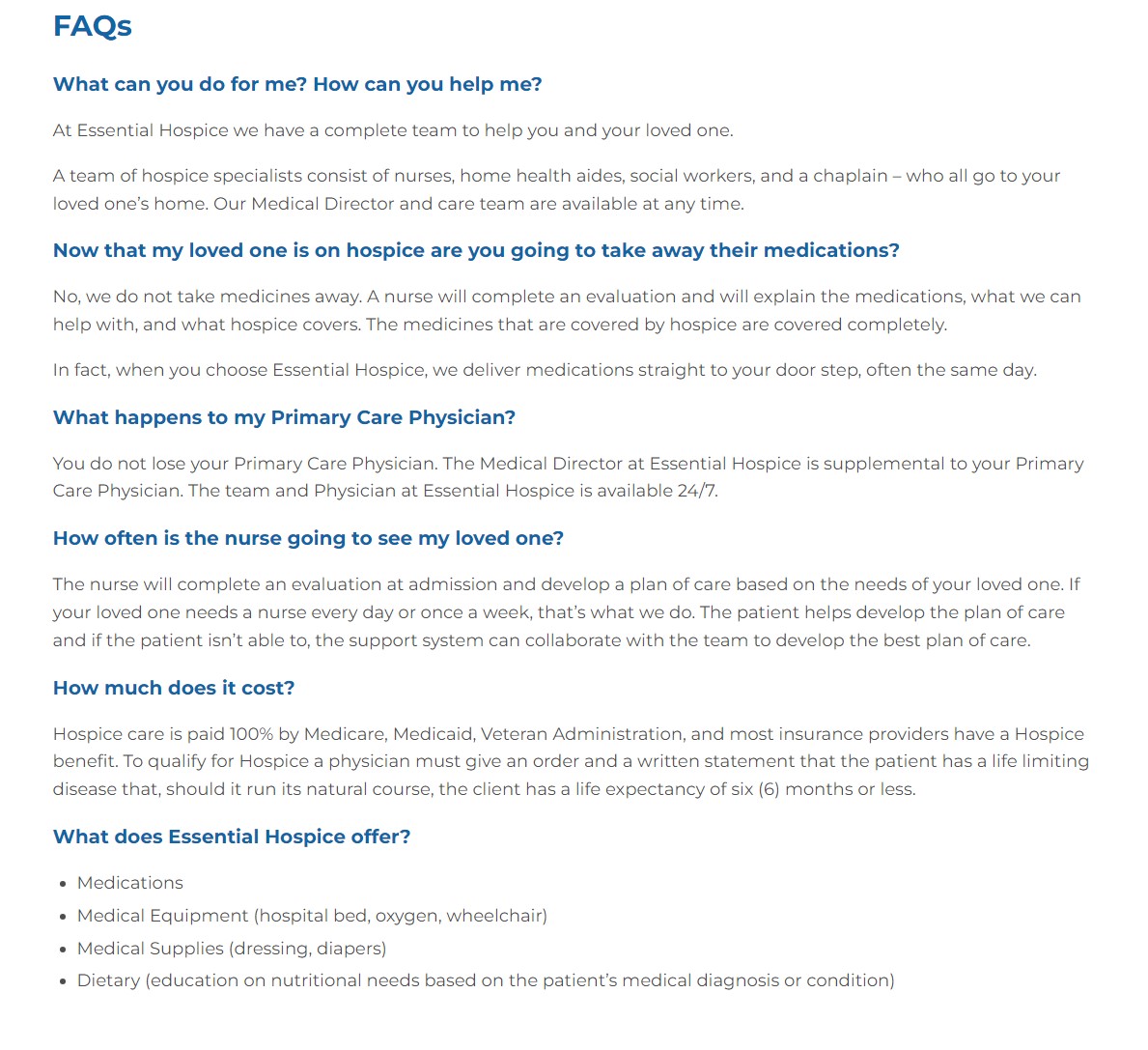
The old page makes the questions and answers almost indistinguishable from one another at a glance. Hurting people's ability to search for information on the page. The new version makes it clearer which part is the question and which part is the answer, making it easier for users to find the answers to their questions.
Improvements
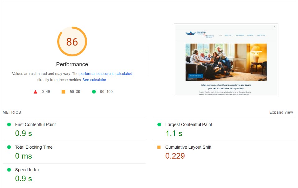
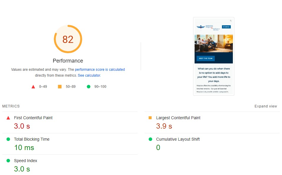
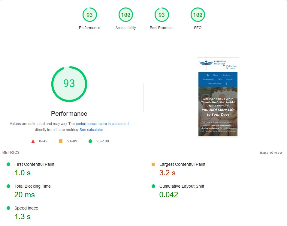
Speed & Mobile Responsiveness
One of the biggest advantages of updating your website is the improvement of page load speed and mobile responsiveness. As we've stated in previous blogs, page load times and performance on mobile devices drastically affect your sites SEO ranking. That's why we ensure all our sites score highly in both areas, but once again, don't just take our word for it. Google's own PageSpeed Insight says more then we can.
Speed Score
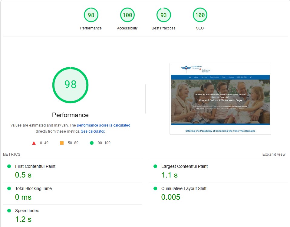
Mobile Score
Conclusion
That concludes our showcase of Essential Hospice & Palliative Service website and how bringing an old website into modern times can make a huge difference. Both in terms of professionalism and user first impressions. Contact us if you would like to breathe some new life into your website today.
Posted in: Case Studies